A stylish groom’s outfit matters as much as the bride’s dress. When both outfits coordinate, the couple looks like they belong in the same photograph. When they clash, every picture tells the story. Coordination comes down to three things: matching formality, pairing colors and fabrics that complement each other, and connecting the two looks through at least one shared detail.
How to Coordinate When You Have Not Seen the Dress
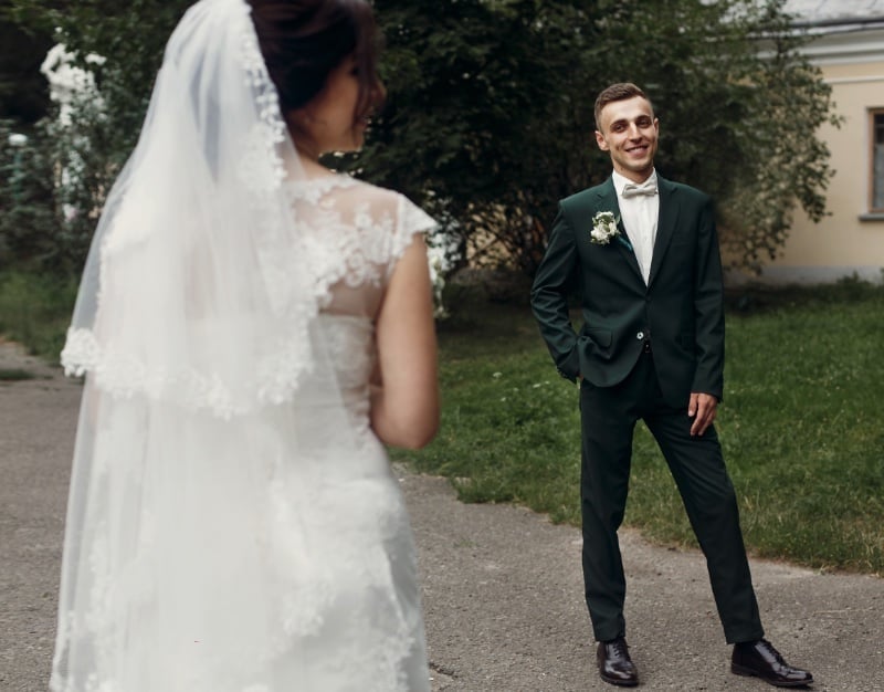
Many couples still keep the bride’s dress secret until the ceremony, a tradition rooted in arranged marriage customs that persists because the groom’s first reaction remains one of the most photographed moments of the day. Bridal designers like OKSANA MUKHA build entire collections around that reveal, with hand-embroidered details and lacework designed to photograph well from a distance and reward a closer look. But keeping the dress a surprise creates a coordination problem, and solving it requires a few specific workarounds.
The most effective method is a shared accent color. The bride selects her accent shade, a dusty rose, sage, burgundy, or whatever runs through her accessories and bouquet, and passes a fabric swatch or Pantone chip to the groom. He works that shade into his tie, pocket square, or boutonniere wrap. The dress itself stays secret; the connecting thread does the coordination work.
A second option is a shared florist. If the bride’s bouquet and the groom’s boutonniere come from the same arrangement, they match by default. A third is a go-between, a wedding planner or trusted family member who sees both outfits and can flag a clash before the day arrives. Couples who prefer the “first look” or who shop together can skip these steps and match fabrics and tones side by side.
Matching Formality & Fabric
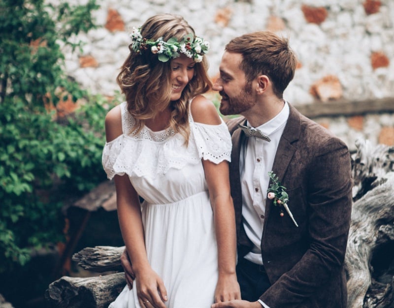
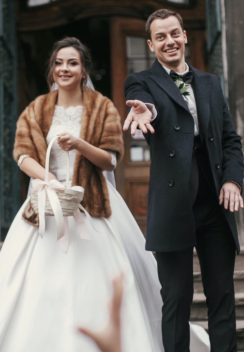
The first rule of pairing is that both outfits belong at the same event. A structured ball gown with beading calls for a tuxedo or a dark formal suit in wool or a mohair blend, because the weight and sheen of those fabrics sit at the same level as the gown. A flowing chiffon or crepe dress at a garden ceremony pairs best with a lighter suit, an unstructured linen blazer and trousers, or a cotton-blend separates combination, because both fabrics share that relaxed drape.
A lace sheath dress for a rustic or boho wedding works alongside a textured tweed jacket or a soft flannel suit in a warm neutral. The principle is that the fabrics should feel like they come from the same world. If the bride’s dress is structured and heavy, the groom’s suit should have similar body. If her dress is light and fluid, his outfit should follow.
Pairing Colors That Work Together
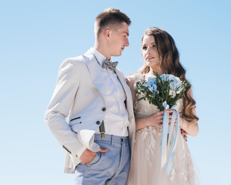
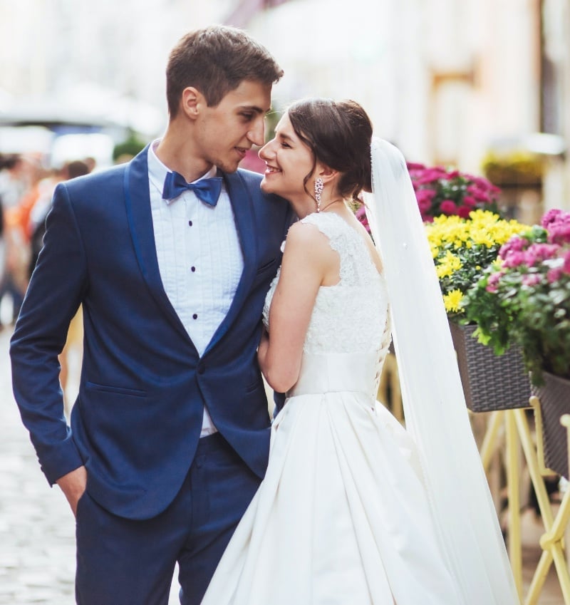
Matching the exact color of the bride’s dress is the most common mistake grooms make, and it flattens both looks in photos. A white suit next to a white gown erases the contrast a camera needs; ivory next to ivory does the same. The groom’s base color should complement the dress, and that means choosing a tone that creates separation.
For a classic white or ivory gown, charcoal, navy, and black all create clean contrast. Charcoal wool photographs as the most versatile because it separates from both pure white and warmer ivory tones. Navy works well for spring and summer ceremonies and pairs naturally with blush and gold accents. For a champagne or blush-toned dress, a medium gray or a warm tan suit creates enough distance.
For a bolder dress color, like a deep red or emerald, a dark neutral suit lets the dress stay the focal point. The accent color, repeated in the tie, pocket square, and boutonniere, is what ties the groom’s palette back to the bride’s. A burgundy tie against a charcoal suit connecting to a burgundy sash on the bride’s gown is a pairing that photographs as one coordinated look.
Balancing Visual Weight
The groom’s suit should sit a step below the bride’s dress in visual volume. An ivory gown with beading and a cathedral train fills the frame; the groom complements it best in a clean silhouette, a well-fitted two-piece in a single color or a fine pattern like a pinstripe or micro-check. Texture helps the suit hold its own. A herringbone wool for fall, a linen blend for summer, or a midnight-navy mohair for a winter formal all photograph with dimension and keep the groom from looking flat next to a detailed gown.
Coordination That Shows in the Photos
The test of a coordinated wedding look is the portrait. Fabrics should share the same level of formality, colors should contrast enough that both figures stand out, and at least one detail, a shared accent color, a matched flower, a complementary texture, should connect the two looks at a glance. Get those three pairings right and the harmony holds from the ceremony entrance to the last frame of the night.