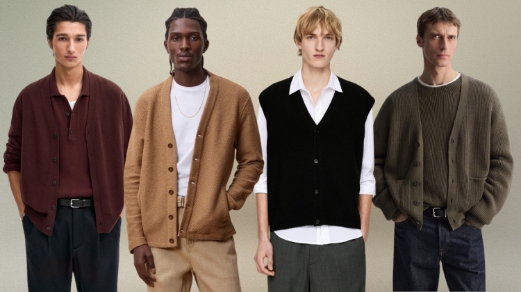
A man sees a floral print and files it under someone else’s closet. That reaction has nothing to do with botany. It comes down to scale, palette and repeat density, the same three variables that locked floral textiles into one setting for a century. Small motif. Pale ground. Tight repeat. Change any one of them and the same flower turns graphic, even severe.
Menswear settled this years ago, on shirts, ties and jacket linings. Interiors are where the idea still surprises people, which is why this piece runs from the shirt to the wall instead of the other way around. One rule governs both, and once you spot it on a collar, you can apply it to a room.
Start With the Peony

The peony proves the argument before a single sentence explains it. The bloom is large and loosely structured, so at any real scale it stops looking like a flower and starts looking like shape and volume. That holds on a camp collar shirt with a single bloom across the chest, and it holds across eight feet of wall. The motif was never the problem.
Ground color does the rest of the work. Charcoal, ink, oxblood and deep forest push the bloom forward and strip out any nursery association. Pastel peony on a cream ground is the trap, the same pairing that made florals feel domestic in the first place. This peony wallpaper runs the full equation, an oversized bloom on a near-black ground, printed for a wall instead of a cushion.
Scale Is the Whole Argument

Here is the mechanic behind all of it. A small, dense repeat photographs as decorative, domestic, twee, because the eye can count the flowers. An oversized bloom set against generous negative space photographs as graphic and architectural, because the eye sees shape before it sees species. Same flower, opposite effect, and the difference is a function of size and spacing alone.
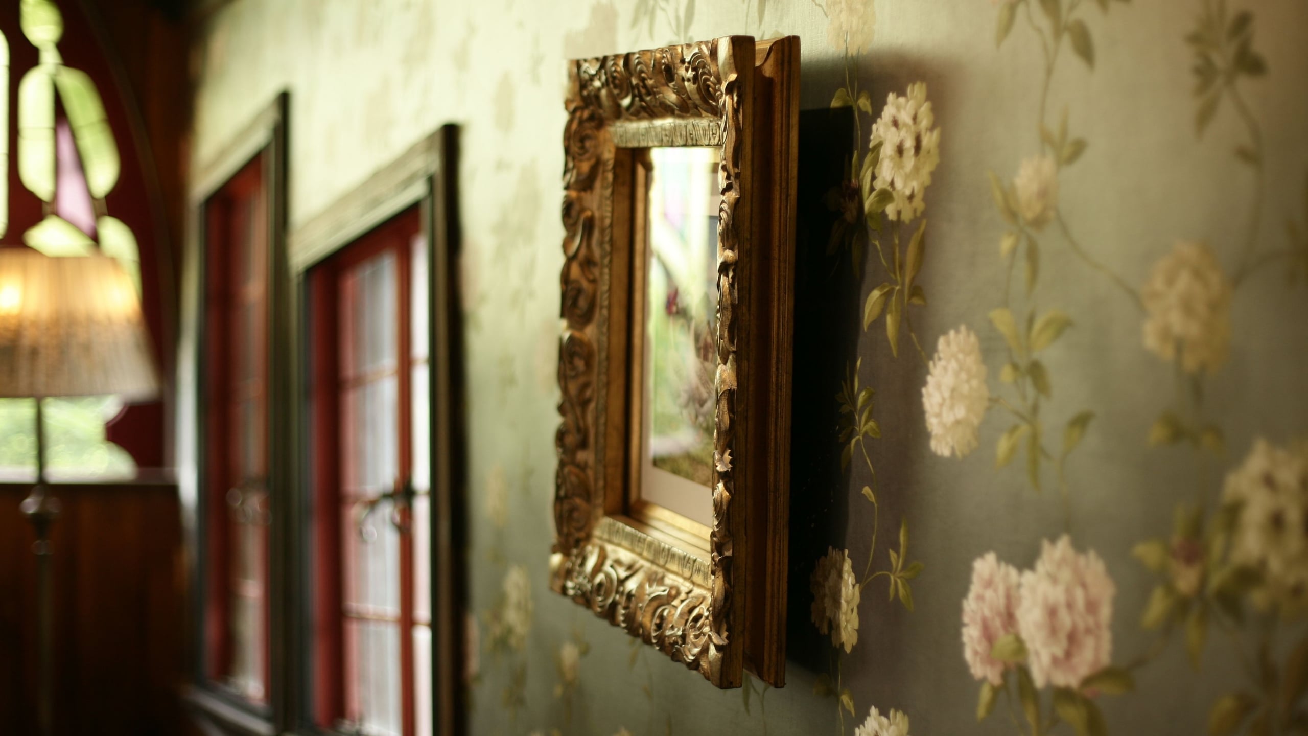
There is a usable test hiding in that fact. If you can identify the species from across the room, the print is too large, on a shirt or on a wall. No exceptions. Ground color is the second variable, and a dark one does most of the heavy lifting. It pushes the bloom forward and removes any hint of nursery pastel. Between scale and ground, that is a complete test to run in a shop or against a wallpaper sample book.
What Menswear Already Figured Out
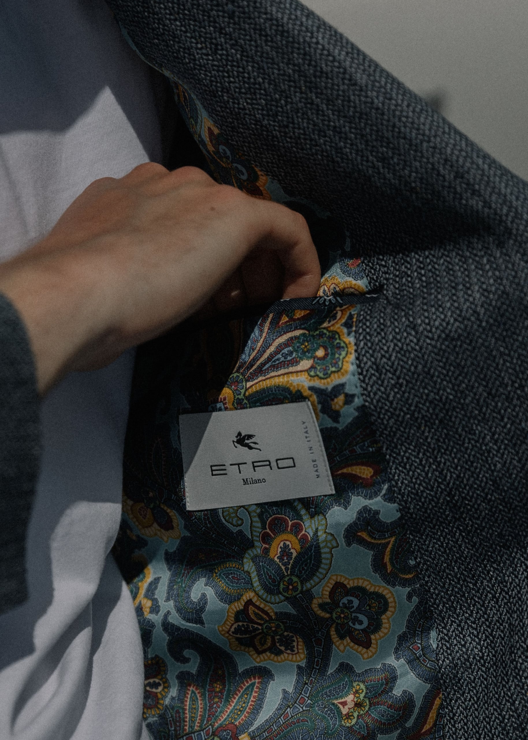
Menswear worked out the scale rule in three garments, in ascending order of confidence. The lining is the covert entry point, floral silk inside an odd jacket, visible only when the wearer removes it or reaches into a pocket. Nobody has ever been criticized for a lining.
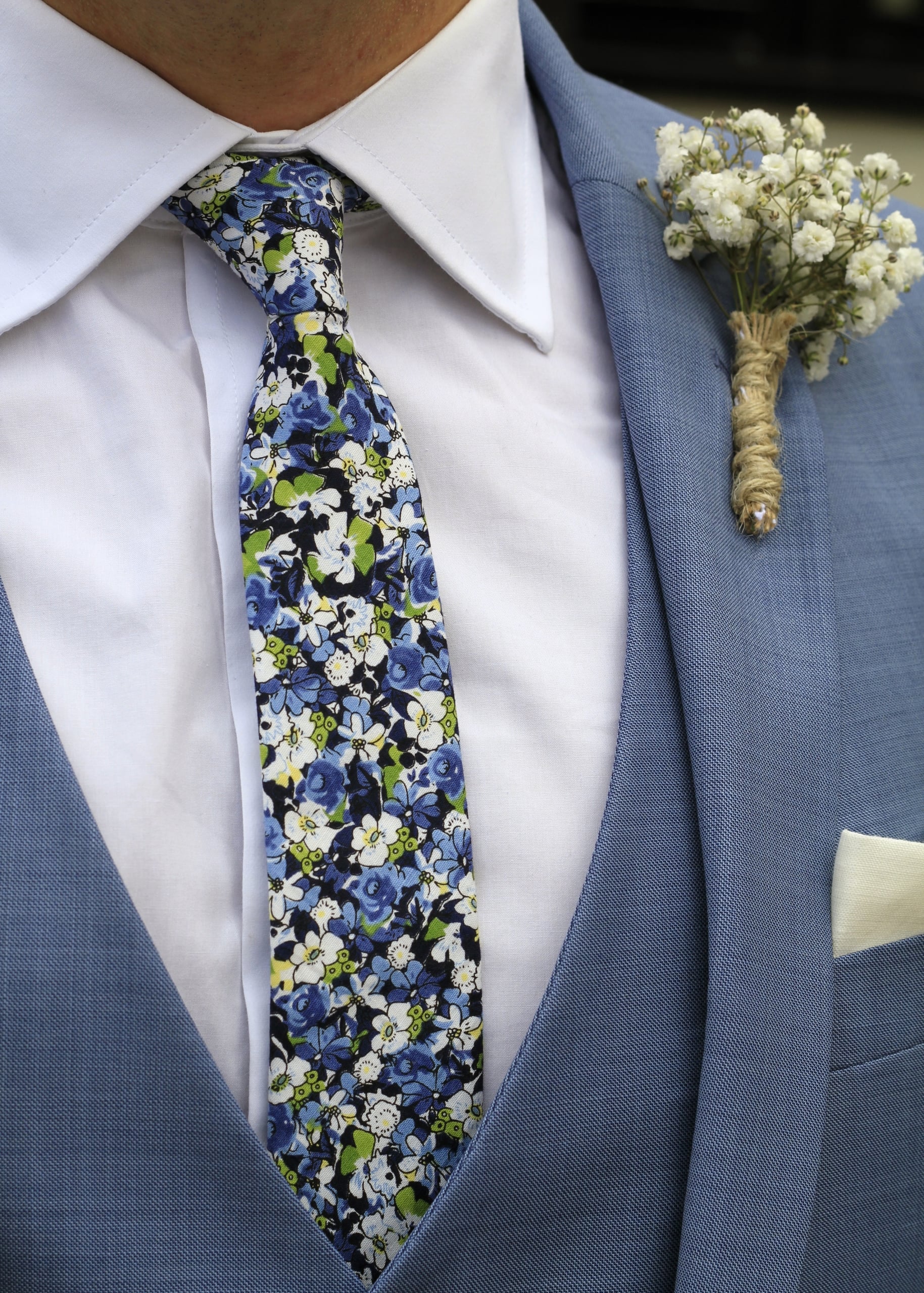
The tie inverts the rule slightly. It is the smallest surface in the outfit, so it can hold a denser print and still look composed, not busy, the way Liberty-style florals work on wool or grenadine. Density that would overwhelm a shirt sits comfortably on four inches of silk.

The camp collar shirt is the real entry point, and it deserves the most attention. A large-scale peony or hibiscus print on a dark or saturated ground, worn open over a plain white tee, puts one strong pattern against a flat field and lets that contrast do the work the rest of the outfit skips. Fabric weight matters as much as the print. Rayon and linen drape and let the pattern shift with the body, while poplin stiffens the same print into something cheap.
One rule ties all three garments together. One floral per outfit. Everything else plain. That restriction is what lets the print hold its weight instead of adding noise, and the same restriction is about to apply to an entire room.
Now Put It On the Wall
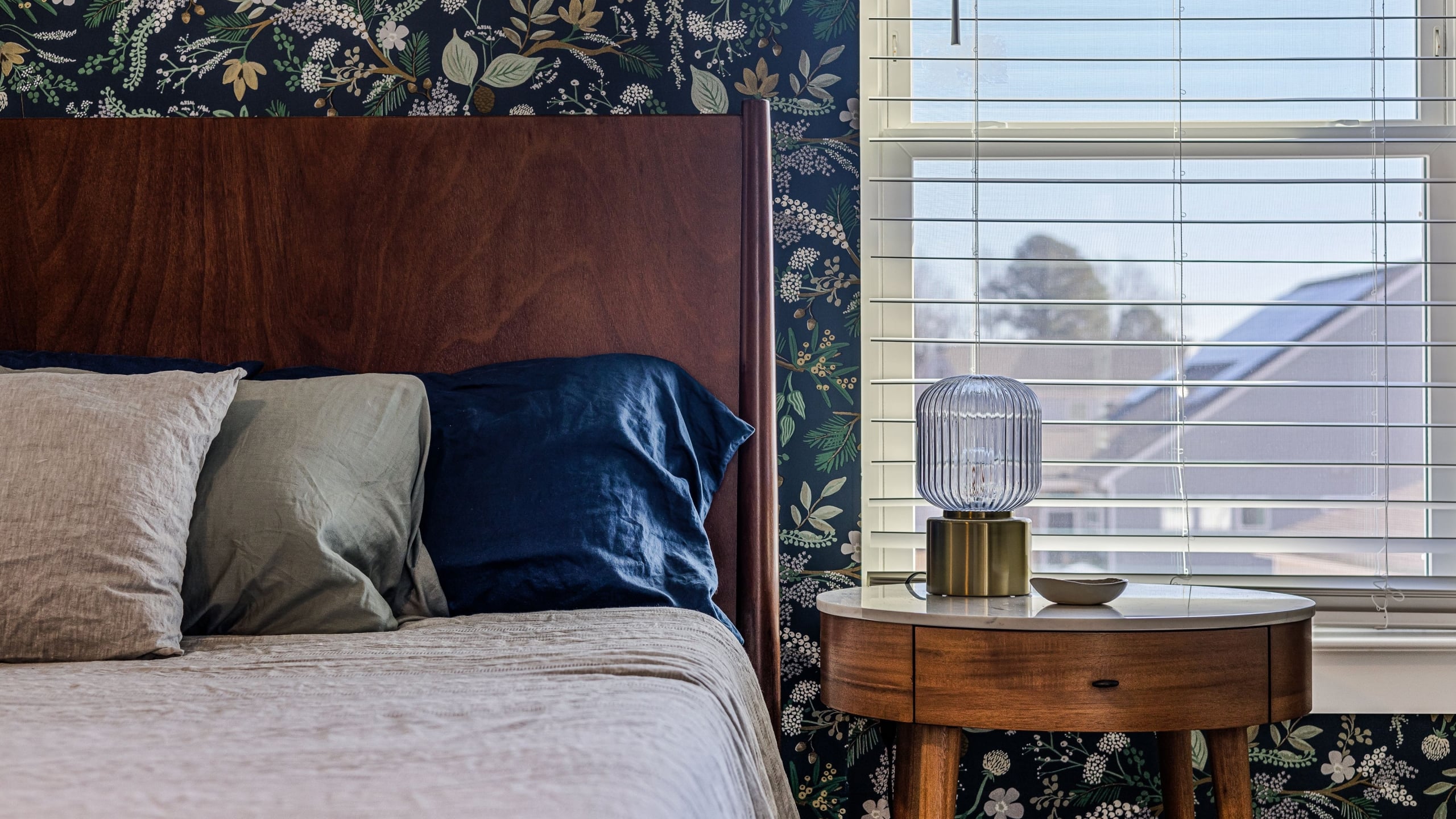
The rule scales up along with the surface. Ink, near-black, forest and aubergine grounds work in enclosed rooms, a den, a study, a bedroom, a powder room, where saturation is an asset instead of a risk. The same math that worked on eight inches of shirting works on eight feet of wall, because the room supplies the negative space the collar supplied before.
“One floral per outfit” becomes “one patterned surface per room.” Nothing else in that room gets a print, and that restriction is what keeps a dark, oversized floral looking assured instead of chaotic. Dark wallpaper in a small room looks chosen, not cramped, once everything else in the room stays plain. That fear is the one most readers walk in holding, and it dissolves as soon as the rest of the room stays free of pattern.
Pair it with brass or blackened metal hardware, walnut furniture and plain-textured fabrics, linen, boucle, leather. None of them compete with the wall for attention.
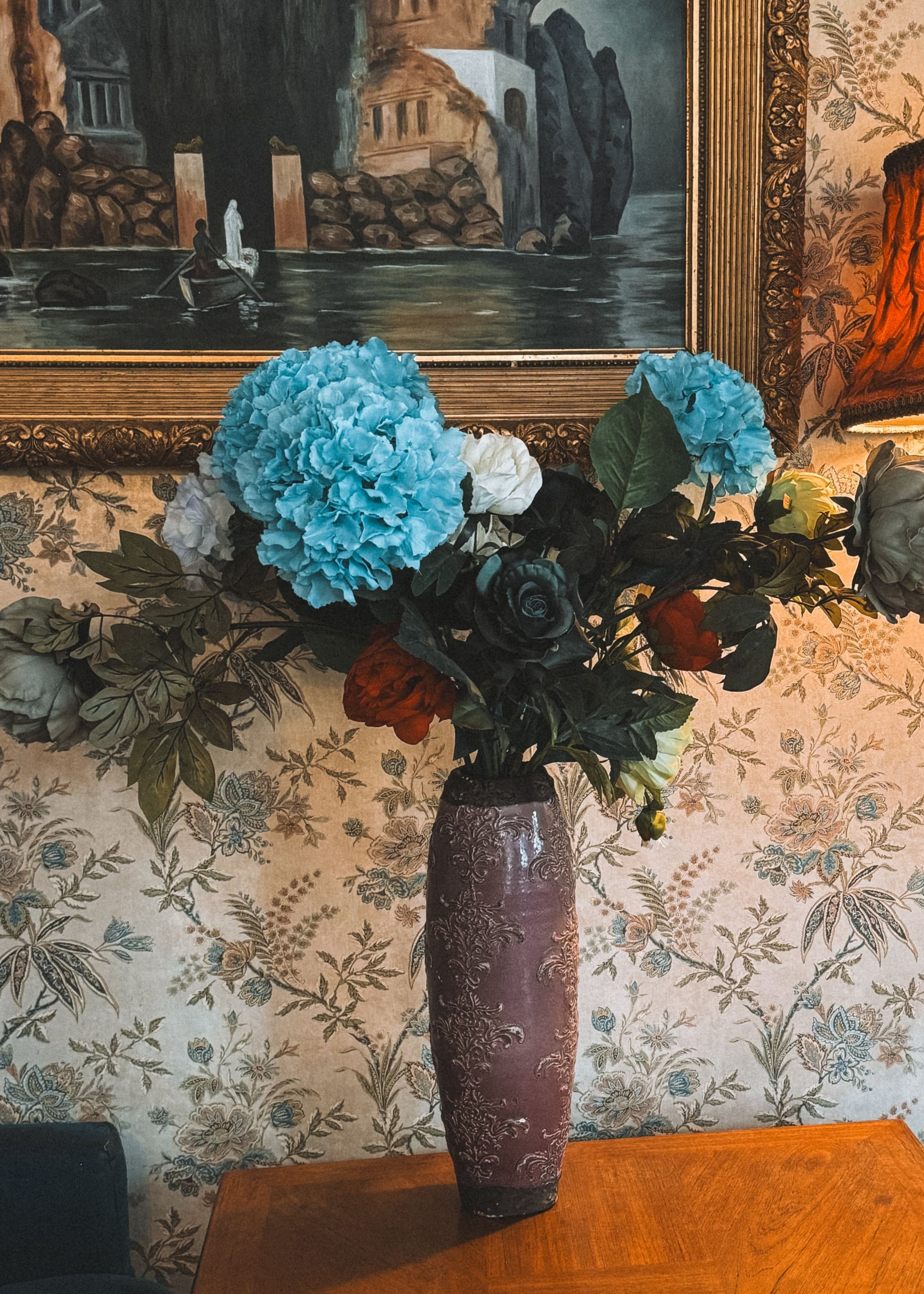
For anyone who wants the lowest-commitment version, one wall does the job. Behind the bed or behind the sofa are the two positions that work, because both give the print room to sit as a single field instead of a broken one. The window wall is the one to skip. Window trim, blinds and light switches interrupt a large-scale print and cut it into fragments instead of letting it work as one surface. Peel-and-stick versions exist for anyone renting the wall instead of owning it.
Florals Were Never Gendered

They were printed small, pale and dense, and the convention outlived the reason it existed. Get the scale right, on a collar or across a wall, and a floral stops being a statement and turns into texture. Picture a peony the size of a dinner plate, three shades darker than the wall behind it, with nothing else in the room arguing back.