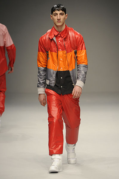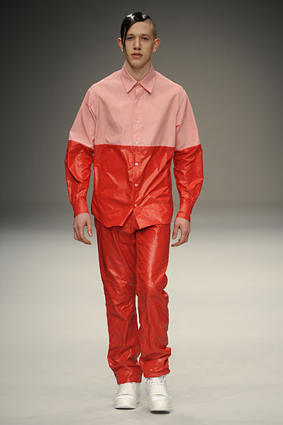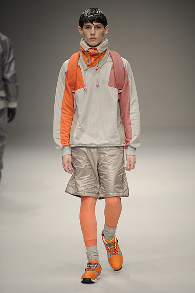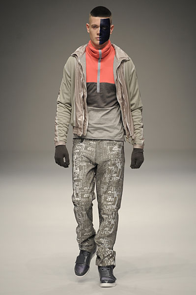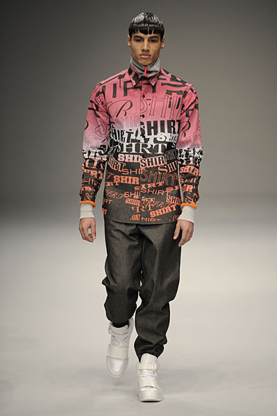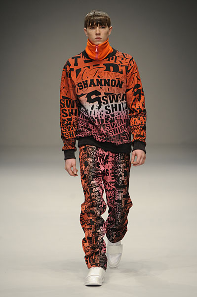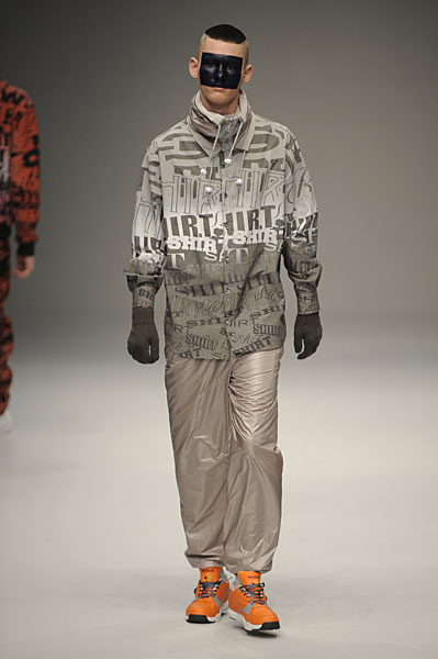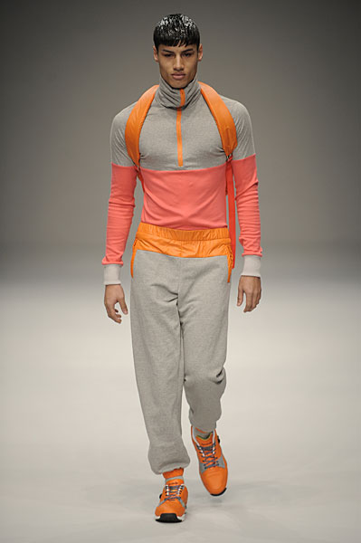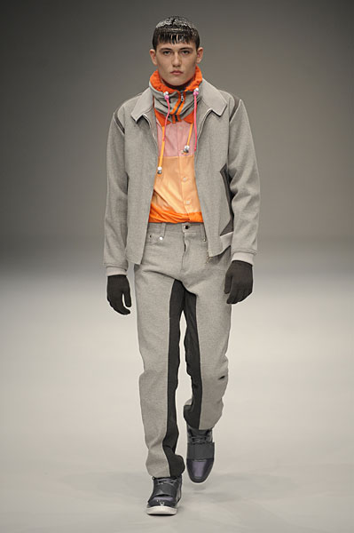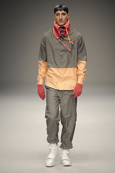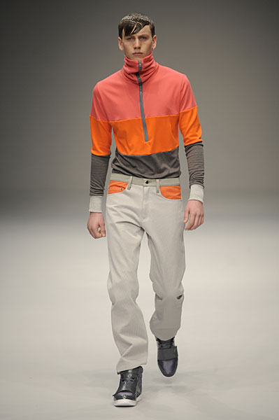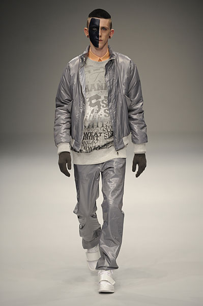
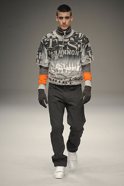
Christopher Shannon describes his aesthetic as “refined scallyism.” Shannon’s first two collections hinted at this aesthetic, but this season utterly lacks the sense of refinement. The color palette of gray, red, orange, and peach is interesting, but overshadowed by Shannon’s branding. Last season, Shannon sparingly utilized textual graphics, resulting in certain quirkiness. This season, he has added his name to the mix and relies on this element so heavily that it comes off as repetitive, uninteresting, and inexpensive. On the positive side, Shannon’s work with the cowl necks is visually appealing and show some form of hope for the future.